Nature's Realm · Echoes of Color
In the boundless tapestry of the natural world, colors are not merely visual phenomena but silent storytellers, carrying the essence of landscapes, the rhythm of seasons, and the spirit of wild places. From the icy blues and pristine snowscapes of Qinghai Lake, where the air shimmers with cold clarity, to the sacred Tibetan blues and earthy Gobi ochres of Namtso, where the plateau stretches endlessly under a dome of sky, and then to the lush, undulating verdant greens of Ruoergai grasslands, where the wind carries the scent of wildflowers and the murmur of streams, we delve deep into the heart of nature to extract colors that are not just authentic, but alive with the energy of their origins. These hues are not manufactured or exaggerated; they are the very soul of the land, captured and translated into a palette that bridges the gap between the wild outdoors and the spaces we inhabit.
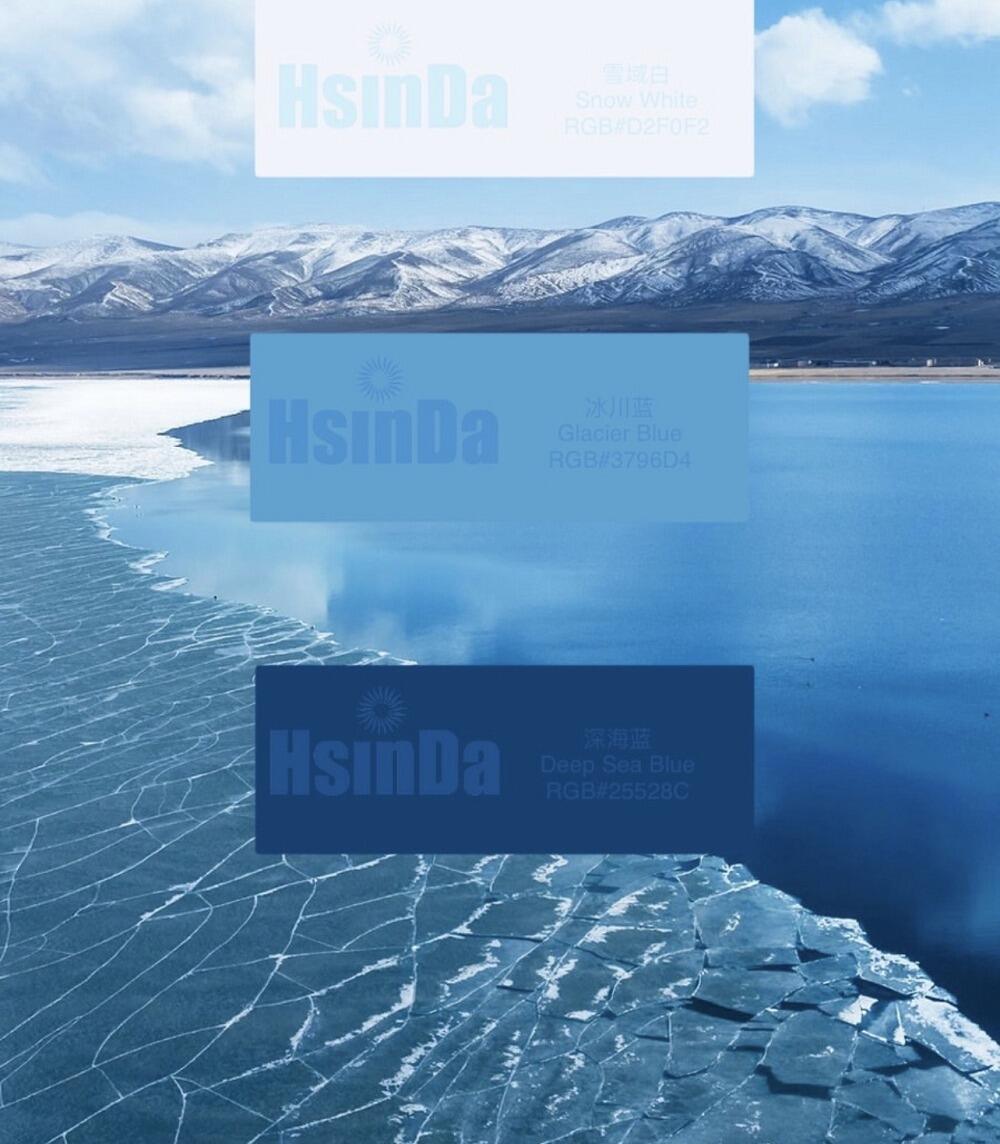
The Qinghai Lake Series draws its inspiration from the lake’s dramatic seasonal transformations and the stark, breathtaking beauty of its high-altitude setting. Nestled on the Qinghai-Tibet Plateau, Qinghai Lake is a sanctuary of stillness, where the water merges with the sky in a seamless blend of blues and whites. At its core is Snowland White (#D2F0F2), a shade that embodies the purity of the snow-capped mountains surrounding the lake—soft, luminous, and untainted by the chaos of the world below. It is the color of early morning frost on grass blades, of snow dusted across rocky shores, and of the mist that clings to the lake’s surface at dawn. Complementing this purity is Glacier Blue (#3796D4), a hue as clear and crisp as the glacial meltwater that feeds the lake. It reflects the bright, unfiltered sunlight of the plateau, capturing the sharpness of the air and the sparkle of water droplets in the wind. Finally, Deep Sea Blue (#25528C) anchors the palette with its profound depth, representing the darker, more mysterious waters of the lake’s center, where light fades into shadow and the lake holds the secrets of centuries. Together, these three colors create a dialogue between the frozen landscape and the vast, endless high-altitude sky—a conversation of calm, purity, and timelessness.
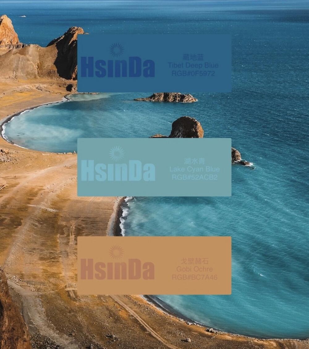
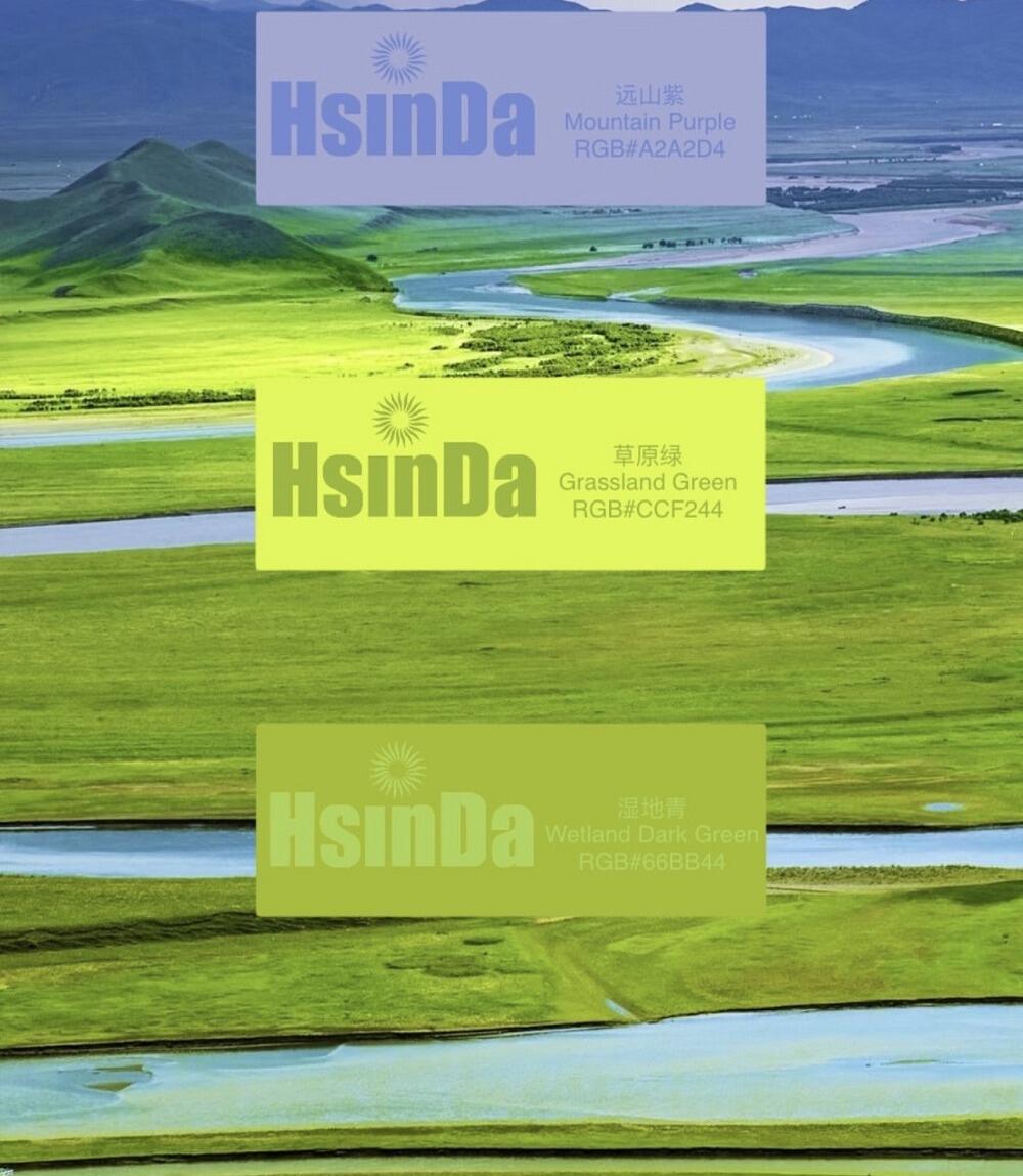
The Ruoergai Series, by contrast, celebrates the vitality and abundance of the Sichuan-Tibet grasslands, a region known for its rolling hills, vast wetlands, and diverse wildlife. Here, the landscape is a symphony of greens and blues, punctuated by the soft purples of distant mountains. At the heart of this series is Mountaintop Purple (#A2A2D4), a delicate, hazy shade that captures the distant allure of the snow-capped peaks that frame the grasslands. Seen through the thin plateau air, the mountains take on a dreamlike purple hue, adding a sense of mystery and depth to the horizon. Complementing this is Grassland Green (#CCF244), a vibrant, lively green that represents the lush, healthy grass that covers the plains in summer. It is the color of growth, of vitality, and of the herds of yaks and sheep that graze peacefully across the landscape—warm, energetic, and full of life. Rounding out the series is Wetland Blue (#66BB44), a unique shade that blends the green of vegetation with the blue of water, inspired by the countless marshes and streams that crisscross the grasslands. This hue embodies the life-giving force of water in this arid region, supporting a rich ecosystem of birds, plants, and animals. Together, these colors capture the very breath and pulse of the Sichuan-Tibet grasslands—their energy, their beauty, and their delicate balance of life.
 Hot News
2026-06-22
2026-05-28
2026-05-28
2026-04-17
2026-04-02
2026-04-01